Hey, let's build a light bulb!
Or, at least the on/off switch part of the light bulb... The toggle switch is a super common user interface element to indicate whether some feature is active or not.
Switches like these are in fact so common, it would sure be nice if they were their own HTML element...
<label>
	<strong>Lightbulb</strong>
	<toggle-switch></toggle-switch>
</label>
Well, through the magic of web components, it's actually possible to make this!
My goal is to illustrate one way how to both build and test a web component. However, instead of going step-by-step "here's the code for making a toggle switch," we're gonna acutally (in some sense) assemble a light bulb representing the key aspects to building a reusable web component, which apply when creating any reusable element.
As we assemble this light bulb piece by piece, we will also be making the toggle-switch component we know and love!
So all that said, let's build a light bulb!
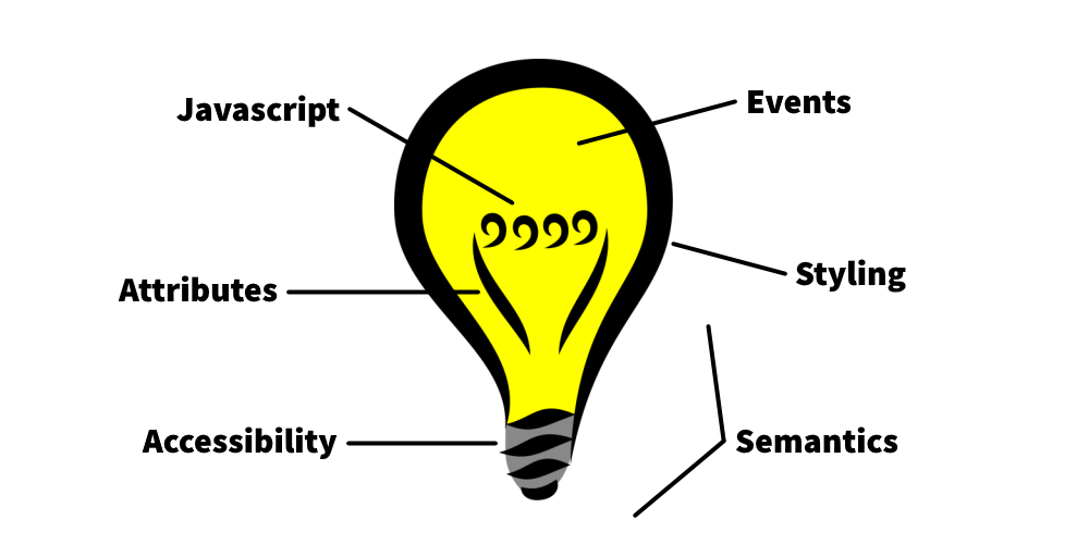
Key Takeaways
Permalink to "Key Takeaways"Here's a bit of a tl;dr showing all the big points to think about when creating web components.
- Web Components create new semantics through custom elements.
- Accessible components allow for multiple methods of interaction.
- Attributes surface important state, configuration, and nuanced meaning.
- Javascript functions expose key element behaviours and actions.
- Events communicate key actions or changes for other elements to react to.
- Styling is made available through carefully chosen CSS variables and shadow parts.

And here are all the web component coding ideas that are touched by implementing the <toggle-switch> component. See how we use them to build the component, or just reference the resources below!
- Constructing web components like a pro.
- @open-wc/testing provides useful testing helpers for putting our component on a web page.
- @web/test-runner runs our tests in a real browser.
- Test Fixtures set up an element on a page for testing.
- connectedCallback initializes an element when inserted onto the page.
- Attributes and properties can be set on custom elements.
- observedAttributes and attributeChangedCallback react to changes in attributes.
- disconnectedCallback cleans up after an element when it is removed from the document.
- oneEvent tests that an event has occurred.
- Custom Events let you dispatch events specific to your component.
- Shadow DOM encapsulates structure, style, and behaviour from the overall document.
- Shadow Parts allow outside CSS to customize specific inner elements of a web component.
- :host lets you style the web component itself from its shadow dom.
I have also created a <toggle-switch> web component you can install and use on your projects or use as reference:
Inventing a Light Bulb
Permalink to "Inventing a Light Bulb"In each section, I will:
- Discuss an aspect of web components, including why it is important
- Apply that aspect to building the
<toggle-switch>component, with code
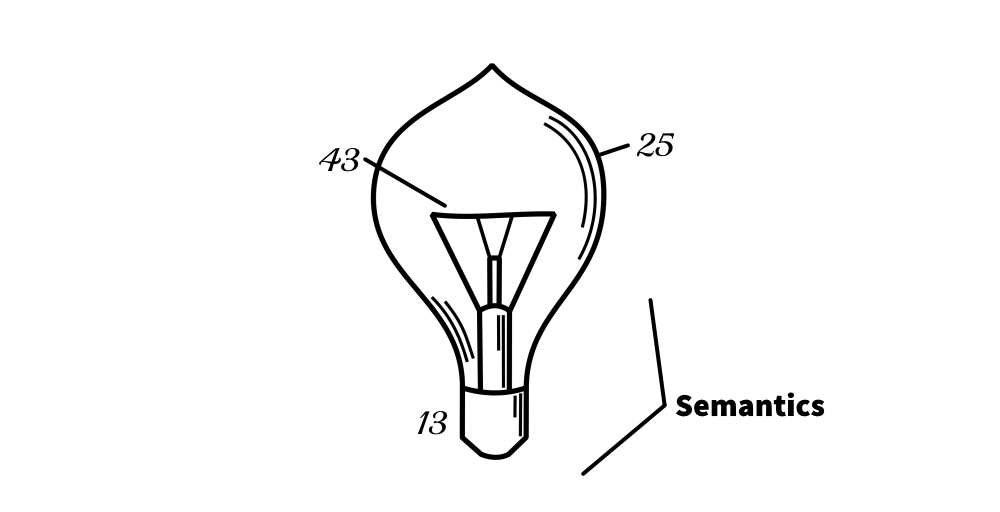
Semantics: The Schematic
Permalink to "Semantics: The Schematic"All good inventions start off with a drawing showing the design! Before building the web component, we need to think about why we're building it.
Well, what is a web component anyway?
To answer that question, we need to answer a different question: What is a block quote?
Well, it's pretty common for articles like this one to want to quote someone or something, for instance Thomas Edison:
To invent, you need a good imagination and a pile of junk.
You can tell it's a quote of some kind by its formatting. And thankfully, the code to make this happen is quite simple:
<blockquote>
	<p>To invent, you need a good imagination and a pile of junk.</p>
</blockquote>
The <blockquote> bit is an HTML tag with special meaning. When a developer uses it, they are declaring that the following text is a section that is quoted from another source
.
You see, to achieve the formatting of a block quote, I didn't need to use the blockquote element at all. I could have used some other HTML element and forced it to look like a quote, but while that may be useful for visual readers, it would not be useful to bots or to readers relying on assistive technology to read the page out loud.
What is assistive technology?
Many people have disabilities which hinder them from using a site in common ways, and so they rely on assistive technology to navigate the internet. An example of such a technology is a screen reader, which verbally reads the page so vision-impaired people can understand the content.
In other words, that blockquote tag has special meaning, called semantics, and those semantics allow anything reading the page to understand what the contents represent. Just like block quotes, most HTML elements have special semantics associated with them.
Ok Timothy, what do block quotes have to do with web components?
So, our goal is to create a new HTML element, <toggle-switch>. Keeping in mind that most HTML elements have associated semantics, this leads us to an interesting insight:
This is not normally the way I see web components described. Usually, web components are thought of in developer-centric terms like reusability and encapsulation. While those are indeed great goals and outcomes, framing a web component in terms of its semantics really helps capture why we are making it and what it will do.
So, when it comes to building a new component, the first step is to understand what is its purpose, and that helps you decide what its responsibilities and scope are.
For our <toggle-switch> component, it's pretty similar to a native HTML checkbox, but with one distinction: whereas a checkbox is either checked or unchecked, our switch element is either on or off, which is a subtly different semantic.
Once we have defined the what and why of the web component, we can create a bit of scaffolding! Let's start with a skeleton component:
export class ToggleSwitch extends HTMLElement {
	static elementName = 'toggle-switch'

	constructor() {
		super()
	}
}

window.customElements.define(ToggleSwitch.elementName, ToggleSwitch)
The customElements.define global function is what actually defines a web component, and it must be supplied with both the name of the element and a class extending an HTMLElement. All of our eventual functionality will go into the ToggleSwitch class.
As for testing, we are going to rely on two libraries:
@open-wc/testing: A testing library providing useful helpers for mounting our component@web/test-runner: A program that will actually run our tests against a real browser
I'm highlighting the "against a real browser" bit because doing so provides the highest confidence that the element as it behaves in tests will be the same as it behaves in the wild. This is opposed to using something like jsdom, which has classically had poor support for web components.
These libraries can be installed with npm:
npm i -D @open-wc/testing @web/test-runner
With that, all we need now is a skeletal test file and the ability to run said test:
// toggle-switch.spec.js
import { expect } from '@open-wc/testing'

describe('toggle-switch', () => {
	it('works', () => {
		expect(1).to.equal(1)
	})
})
Running the test:
wtr --node-resolve ./**/*.spec.js
And with that, we are finally ready to start building out our <toggle-switch> component!
Accessibility: The Cap
Permalink to "Accessibility: The Cap"The light bulb's cap is where it accesses its power. Therefore, the cap represents accessibility!
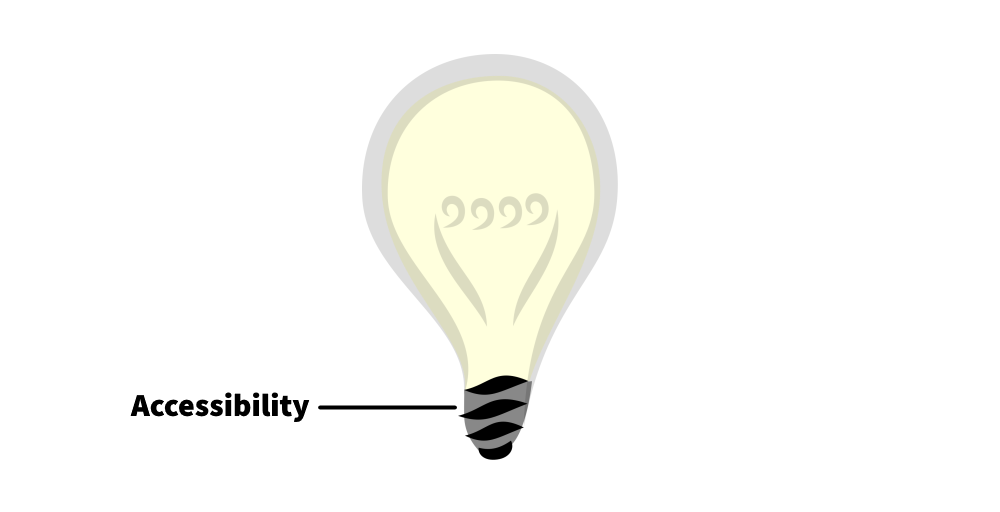
Accessibility is the practice of making things usable by as many people as possible, regardless of ability or disability. For example, if a blind person is relying on a screen reader to read the page out loud to them, then when they reach the toggle switch, they need to be made aware that the element is indeed a switch.
It is a fairly broad topic that I cannot possibly cover in full here, but when it comes to web components, there are some key questions we can ask:
- What role or set of roles does our component serve?
- How will readers know what this component is and how to use it?
- In what ways might people use this component, and do we need to do anything special to accommodate those?
Personally, I like using accessibility as a starting point so that good practices are built into the component earlier rather than later. Let's apply this concretely to the toggle switch!
For coding, let's start by answering the key questions:
- What role or set of roles does our component serve?
WAI-ARIA defines a role called "switch" which actually fits our component perfectly. If we specify this role on our component, assistive technologies such as screen readers can inform their listeners that they can toggle something on and off.
What is WAI-ARIA?
WAI-ARIA stands for Accessible Rich Internet Applications, and it essecially provides a framework for making advanced website stuff more accessible to people with disabilities.
- How will readers know what this component is and how to use it?
Sometimes special labelling is needed to properly inform people who can't see the element what it is. In our case, we can rely on the switch role to do that: when a screen reader encounters an element marked as a switch, it should announce that the element is a switch without us having to do any extra work!
- In what ways might people use this component, and do we need to do anything special to accommodate those?
Besides clicking on the switch, some people might not have or cannot use a mouse, and hence the switch should be interactable via keyboard.
Taking these two concerns together, this means:
- We should set the
roleattribute toswitch. - We should make the element focusable, which can be done by setting
tabindex(see tabindex attribute).
To take care of the first item, let's first write a test:
import { fixture, expect } from '@open-wc/testing'

describe('accessibility', () => {
	it('default role', async () => {
		const el = await fixture(`<toggle-switch></toggle-switch>`)

		expect(el.getAttribute('role')).to.equal('switch')
	})
})
This test does two things:
- Create a fixture which contains our new
toggle-switchelement. - Assert whether the element's accessible role is a switch.
The fixture function provided by @open-wc/testing is rather nifty! It essentially sets up an HTML document and puts our element onto the page, allowing us to mess with and inspect it.
Our test implies we should set up our element to have the "switch" role immediately. To do that, we will rely on a lifecycle method called connectedCallback:
export class ToggleSwitch extends HTMLElement {
	connectedCallback() {
		this.setAttribute('role', 'switch')
	}
}
What are lifecycle methods?
Just like how all living things are born and eventually die, elements on a web page may come and go. Lifecycle methods represent key moments for an element, such as when it gets inserted on the page, removed from the page, or updated.
The connectedCallback function is called every time an element gets inserted into the page, which is great for initialization!
What is different between connectedCallback and the constructor?
The constructor is called when an element is created for the first time, whereas the connectedCallback is called just after the element is added to a page. One way to think of it is if the same element is added to and removed from a page over and over again, the constructor is only called once, wherease connectedCallback is called each time it's added back to the page.
Here's a good summary of what to do with the constructor vs connectedCallback.
For our tabbable requirement, the test and initialization is very similar. Setting tabindex="0" is all that's needed to make an element tabbable, allowing keyboard users to access our switch!
export class ToggleSwitch extends HTMLElement {
	connectedCallback() {
		this.setAttribute('role', 'switch')
		this.setAttribute('tabindex', '0')
	}
}
Now, for our aria role, there's actually a little bit more we need to do for our component to actually be an accessible switch. Conveniently, we'll be talking about that in the very next section...
Attributes: The Contact Wires
Permalink to "Attributes: The Contact Wires"Next on our light bulb are the contact wires which supply power to the part that lights up. This will represent attributes!
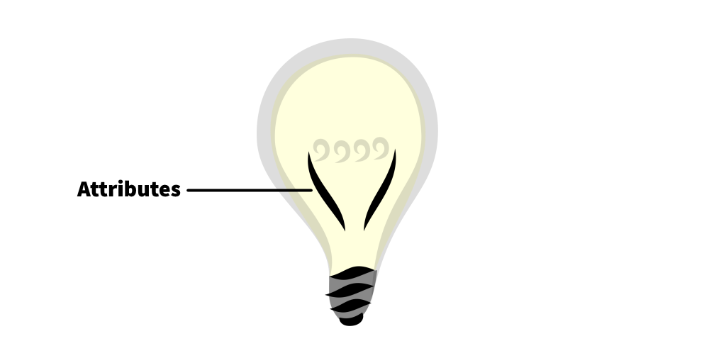
HTML elements have attributes which basically tell more about the element's current state or how it should work. For example, the <blockquote> element has an attribute called cite which is a link to the source of the quote.
<blockquote cite="https://html.spec.whatwg.org/#the-blockquote-element">
	<p>If the cite attribute is present, it must be a valid URL. . .</p>
</blockquote>
As such, custom elements are also able to expose attributes! Their three key uses are for:
- State: Such as an element's initial or current value
- Configuration: Such as whether the element is disabled, has input boundaries, and so forth
- Nuanced Meaning: Specifying more details to an element's semantic value
Building out the <toggle-switch> element, there is at least one important state we want to convey with an attribute: whether the switch is on or off. Let's follow these three steps for creating that attribute:
- Determine a name and allowed values for the attribute.
- Set a property for the attribute.
- Determine whether a change in the attribute triggers a change on the element.
To mimic a bit how the vanilla checkbox input element works, we'll call our attribute checked, and it will be a boolean attribute, meaning its presence or absence will represent true or false respectively.
<!-- off -->
<toggle-switch></toggle-switch>

<!-- on -->
<toggle-switch checked></toggle-switch>
Setting a property for the element's class essentially declares the attribute is important. In truth, any element can have any attribute, so by creating a property we communicate that checked is important for the toggle switch.
class ToggleSwitch extends HTMLElement {
	get checked() {
		return this.hasAttribute('checked')
	}
	set checked(value) {
		this.toggleAttribute('checked', value)
	}
}
And the interesting question: does a change in checked require a change on the element?
I can think of at least two things that should change when the checked attribute is added or removed from the toggle switch:
- The switch should animate (but we'll get to that when we discuss styling)
- The
aria-checkedattribute should reflect thecheckedattribute.
...what?
Recall from earlier that we are relying on the switch role for accessibility. That role requires that an accessibility attribute called aria-checked be set to either "true" or "false".
So, when checked is present, aria-checked must be "true", and when checked is absent, aria-checked must be "false".
Let's write a test for that!
it('checked attribute is updated', async () => {
	const el = await fixture(`<toggle-switch></toggle-switch>`)

	expect(el.getAttribute('aria-checked')).to.equal('false')

	el.toggleAttribute('checked', true)
	expect(el.getAttribute('aria-checked')).to.equal('true')
})
In this test, we first ensure that an unchecked toggle switch starts with an aria-checked of "false", indicating it is off to accessibility stuff. Then, we add the checked attribute and verify that aria-checked has changed to "true".
Now, to actually accomplish this in code requires using a cool feature of web components: observedAttributes and attributeChangedCallback.
observedAttributesis just a list of attributes that the element should react to if changed.- And
attributeChangedCallbackis the function that gets fired when any of the listed attributes change.
class ToggleSwitch extends HTMLElement {
	static get observedAttributes() {
		return ['checked']
	}

	attributeChangedCallback(name, oldValue, newValue) {
		if (name === 'checked') {
			this.setAttribute('aria-checked', this.checked.toString())
		}
	}
}
And finally, we will want to make sure the initial state is taken care of in connectedCallback:
class ToggleSwitch extends HTMLElement {
	connectedCallback() {
		this.setAttribute('aria-checked', this.checked.toString())
	}
}
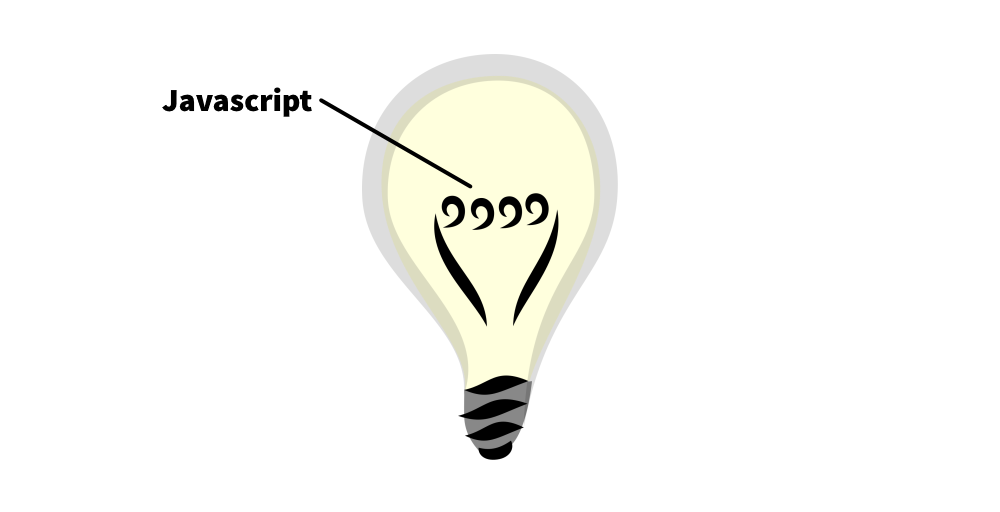
Javascript: The Filament
Permalink to "Javascript: The Filament"And now for the part of the bulb that actually glows: the filament! As the heart of the light bulb, it's fitting for the filament to represent the heart of our component, the javascript API.
What is an API?
API stands for Application Programming Interface. If you think of a car as a program, then its API would be the steering wheel, gas pedal, and brake. You cannot directly manipulate what the engine does and can only do so through those three accessible things.
As such, an API exposes ways to use an element without needing to know all of its messy guts.
Although a web component could be as simple as just coloring text, custom elements are additionally useful for bundling complex functionality into a single doodad. For example, the toggle switch component must allow someone to toggle it on and off, and so a click action must be bound to do that.
Perhaps that's not surprising, so what I find useful is to think of those potential actions as public javascript functions. Another way of putting it, if a reader is able to click the component to toggle it, then there should be a toggle() function available so that other javascript code can simulate the reader's action.
For the toggle switch, when someone clicks on it, the element should go from off to on, or from on to off. As usual, we start with a test!
describe('toggling on and off', () => {
	it('via clicking', async () => {
		const el = await fixture(`<toggle-switch></toggle-switch>`)

		expect(el.checked).to.be.false

		el.click()
		expect(el.checked).to.be.true

		el.click()
		expect(el.checked).to.be.false
	})
})
Here, we are able to use the click() function to simulate someone clicking the element.
To make this test pass, all we have to do is listen for a "click" event and toggle the checked state. We will do this in connectedCallback since that's a good place to handle initialization.
class ToggleSwitch extends HTMLElement {
	connectedCallback() {
		this.addEventListener('click', () => {
			this.checked = !this.checked
		})
	}
}
Looks great, except! Remember our key point:
Key element behaviours are exposed as Javascript functions.
This means we should have a toggle() method exposing this is a key way not only readers can interact with the component, but other javascript code can too.
In fact, we'll make test for this as well!
describe('toggling on and off', () => {
	it('via the api', async () => {
		const el = await fixture(`<toggle-switch></toggle-switch>`)

		expect(el.checked).to.be.false

		el.toggle()
		expect(el.checked).to.be.true

		el.toggle()
		expect(el.checked).to.be.false
	})
})
This test is extremely similar to the previous test, with the primary difference this uses a public function (toggle()) rather than a user action (clicking).
Doing this allows two things. First, we can actually simplify the event listener from above to use our new function:
class ToggleSwitch extends HTMLElement {
	toggle = () => {
		this.checked = !this.checked
	}

	connectedCallback() {
		this.addEventListener('click', this.toggle)
	}
}
But additionally, we can now clean up the event listener with the disconnectedCallback hook!
class ToggleSwitch extends HTMLElement {
	disconnectedCallback() {
		this.removeEventListener('click', this.toggle)
	}
}
As a mirror to connectedCallback, the disconnectedCallback function is called every time the element is removed from the document. It is most useful for cleaning up listeners it may have set up elsewhere.
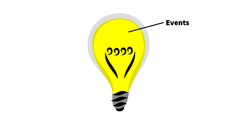
Events: The Inert Gas
Permalink to "Events: The Inert Gas"So it turns out there's a part of a light bulb you can't see but is nonetheless important for it to work: the inert gas! The bulb is filled with special air that extends the lifetime of the filament.
Continuing our Light Bulb of Web Components, the gas is represented by the event API, stuff happening under the surface but significant for other things to react to changes in our component.
An event is essentially a tidbit of code declaring that something happened, for instance "Hey, somebody toggled me on!" By emitting an event like this, listeners can react with some appropriate action.
When building a web component, we should think about what events it should emit that other elements may need to react to. In fact, this is the primary mechanism by which our <toggle-switch> element will even be useful!
In essence, our goal is for our element to be used like this:
const toggleSwitch = document.querySelector('toggle-switch')

toggleSwitch.addEventListener('toggle-switch:change', (e) => {
  	// code toggling light/dark mode
})
Thinking about our <toggle-switch> component again, what are the key events we want it to emit? For the most part, there's just one: whether its state changes from off to on or vice versa.
So, whenever the checked state changes, the element should emit an event!
To write a test, we must ask three questions.
- What is the event's name?
- When does the event occur?
- What details should be shipped with the event?
The answers to these questions will fit into this nice testing template:
import { oneEvent, fixture, expect } from '@open-wc/testing'

describe('events', () => {
	it('turned on', async () => {
		const el = await fixture(`<toggle-switch></toggle-switch>`)

		setTimeout(() => /* (2) WHEN */)
		const { detail } = await oneEvent(el, /* (1) NAME */)

		/* (3) ASSERT DETAILS */
	})
})
Answering the questions...
- Name: Since our event represents a change in the state, we'll call the event "toggle-switch:change".
- When: Let's emit the event any time
checkedis added or removed from the element. - Details: Events can carry additional information so that listeners know both what happened and anything else that may be relevant. For our one event, it's probably important to know whether the switch was toggled on or toggled off, so we'll add that to details.
If we plug these things into our testing template, we get a decent test!
import { oneEvent, fixture, expect } from '@open-wc/testing'

describe('events', () => {
	it('turned on', async () => {
		const el = await fixture(`<toggle-switch></toggle-switch>`)

		setTimeout(() => el.checked = true)
		const { detail } = await oneEvent(el, 'toggle-switch:change')

		expect(detail.checked).to.be.true
	})
})
The two important functions in this test are setTimeout (provided by Javascript) and oneEvent (provided by open-wc).
oneEventjust waits for one event to occur, and times out with a failure if the event never occurs.setTimeoutadds our toggle to a list of things for Javascript to do eventually. It's needed because if we didn't use it, our event could potentially fire before we even started listening for it!
Ok, let's actually emit the event now!
Since our event is custom to our new element, we will dispatch a Custom Event, and since we want to do it any time checked changes, we'll perform the dispatch with the code that reacts to when that attribute changes.
class ToggleSwitch extends HTMLElement {
	attributeChangedCallback(name, oldValue, newValue) {
		if (name === 'checked') {
			this.setAttribute('aria-checked', this.checked.toString())
			this.dispatchEvent(new CustomEvent('toggle-switch:change', {
				detail: {
					checked: this.checked
				}
			}))
		}
	}
}
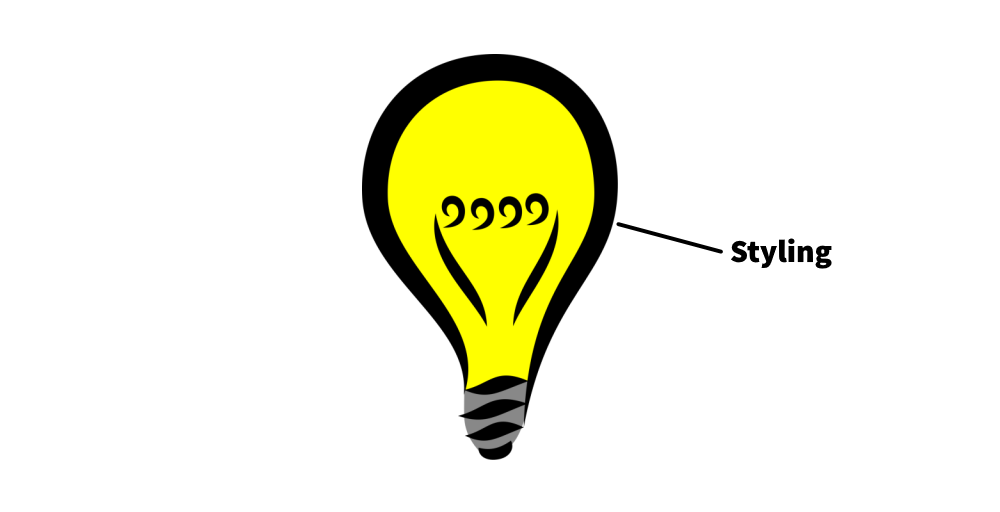
Styling: The Globe
Permalink to "Styling: The Globe"So, we've done all this coding so far, but we can't actually see the switch yet... Let's finally put the globe on our light bulb by adding some styling to our element!
To be honest, styling web components is entirely deserving of its own article, made both interesting and complicated by a tiny thing called the Shadow DOM. MDN covers using the shadow dom in good detail, so for the purposes of this article we'll talk about it just enough to style the <toggle-switch>.
Shadow DOM allows web components to, in essence, carry around their own personal document hidden from the primary web page document. It's kind of like... flowers.

As a gardener, you can't tell a flower what shape to take or how many petals to have, as that's determined by its own DNA. You can determine how many flowers are in your garden, and maybe you can influence some of the flower's colors by feeding it colored water, but beyond that you don't get much say.
Similarly, an element's shadow dom (flower) is encapsulated from the rest of the document, meaning the document (gardener) cannot directly influence elements defined in the shadow dom; neither can different web components clash with each other.
This turns out to be rather important for <toggle-switch> because we now have competing concerns:
- We must use the shadow dom to give our element a decent default "switch look"
- But we also want developers to customize it from outside the component to fit their website's look and feel
These competing concerns are incredibly common, and therefore the shadow dom is actually not completely impenetrable. Although the parent document can never arbitrarily customize stuff in the shadow dom, there are a few exceptions:
- CSS variables can take on values from beyond the shadow dom.
- Elements within the shadow dom can be assigned shadow part names which can be directly selected with CSS.
These exceptions form a web component's Styling API, specifically defined opportunities for customization. And just like how we have to intentionally decide what attributes, javascript functions, and events to expose, we also have to choose what CSS variables or parts can be styled.
Earlier I said we "must" use the shadow dom. Why?
In our case, we want to maintain the internal structure of the element, which means it shouldn't be exposed to the outside. Deciding what goes in shadow dom or not is important for creating an element's style API, but is complex enough to merit its own article.
This stack overflow post helped me understand this concept and links to other useful resources.
At long last, let's style this web component!
To make the switch easy to customize, we are going to minimally style it. Our base switch is gonna be just a square that moves back and forth along a track like this:
First, we must attach a shadow root to the element and create a basic template for our element.
const template = document.createElement('template')
template.innerHTML = `
	<style>
		/* CSS HERE */
	</style>
	<span part="track">
		<span part="slider"></span>
	</span>
`

class ToggleSwitch extends HTMLElement {
	constructor() {
		super()

		this
			.attachShadow({ mode: 'open' })
			.appendChild(template.content.cloneNode(true))
	}
}
Of note, we want developers using this toggle switch to be able to customize both the sliding bit and the track underneath it, so to make that possible we are assigning shadow parts to each element. This will make it possible for users to style those specific components like this:
toggle-switch::part(slider) {
	border-radius: 1em;
}
With the basic template structure done, all that's left is adding CSS! All CSS added will go into the style tag in the template above.
First, let's give the element some basic sizing.
:host {
	display: inline-block;
	width: 2em;
	height: 1em;
	cursor: pointer;
}

span {
	box-sizing: border-box;
	display: inline-block;
	line-height: 1;
}
Two things of interest here:
- The
:hostselector is special in the context of shadow dom. It basically means "style the thing that contains the shadow dom", which is the web component itself. In our case, this styles thetoggle-switchtag. - The
spanonly selects spans within the shadow dom of the element. It does not globally style all spans on the page! That's part of the power of encapsulation.
Next, we'll style the track and slider to look like our squareish examples:
[part="track"] {
	width: 100%;
	height: 100%;
	background-color: #dddddd;
	text-align: left;
}

[part="slider"] {
	width: 50%;
	height: 100%;
	background-color: #777777;
	vertical-align: text-top;
}
And for the last part, we need to style what the component looks like when it has been checked. Recall that the checked attribute on the <toggle-switch> tag determines its on/off state. This can be selected for with an attribute selector using :host!
[part="track"], [part="slider"] {
	transition: all 256ms;
}

:host([checked]) [part="slider"] {
	transform: translateX(100%);
}
We Invented a Light Bulb!
Permalink to "We Invented a Light Bulb!"And with that, we just covered the six key aspects to building great web components! And in the process we built both a light bulb and a toggle switch!
But... is it truly complete?
Almost! There are a few things I skipped over to simplify the tutorial:
- Accessibility: How do we label the switch? Can we integrate this with the HTML
labelelement? - Javascript: When someone tabs to the toggle, can they activate it by pressing Enter or Space?
- Attributes: Can a toggle switch be
disabledlike other HTML input controls?
Feel free to try to tackle these issues yourself! Or, see how it all works in my implementation of the <toggle-switch> element on Github.
Full Code
Permalink to "Full Code"const template = document.createElement('template')
template.innerHTML = `
<style>
:host {
display: inline-block;
width: 2em;
height: 1em;
cursor: pointer;
}
span {
box-sizing: border-box;
display: inline-block;
line-height: 1;
}
[part="track"] {
width: 100%;
height: 100%;
background-color: #dddddd;
text-align: left;
}
[part="slider"] {
width: 50%;
height: 100%;
background-color: #777777;
vertical-align: text-top;
}
[part="track"], [part="slider"] {
transition: all 256ms;
}
:host([checked]) [part="slider"] {
transform: translateX(100%);
}
</style>
<span part="track">
<span part="slider"></span>
</span>
`
export class ToggleSwitch extends HTMLElement {
static elementName = 'toggle-switch'
static get observedAttributes() {
return ['checked']
}
constructor() {
super()
this
.attachShadow({ mode: 'open' })
.appendChild(template.content.cloneNode(true))
}
connectedCallback() {
this.setAttribute('role', 'switch')
this.setAttribute('tabindex', '0')
this.addEventListener('click', this.toggle)
}
disconnectedCallback() {
this.removeEventListener('click', this.toggle)
}
attributeChangedCallback(name, oldValue, newValue) {
if (name === 'checked') {
this.setAttribute('aria-checked', this.checked.toString())
this.dispatchEvent(new CustomEvent('toggle-switch:change', {
detail: {
checked: this.checked
}
}))
}
}
get checked() {
return this.hasAttribute('checked')
}
set checked(value) {
this.toggleAttribute('checked', value)
}
toggle = () => {
this.checked = !this.checked
}
}
window.customElements.define(ToggleSwitch.elementName, ToggleSwitch)
import { fixture, expect } from '@open-wc/testing'

describe('toggle-switch', () => {
  describe('accessibility', () => {
    it('default role', async () => {
      const el = await fixture(`<toggle-switch></toggle-switch>`)

      expect(el.getAttribute('role')).to.equal('switch')
    })

    it('tabbing', async () => {
      const el = await fixture(`<toggle-switch></toggle-switch>`)

      expect(el.getAttribute('tabindex')).to.equal('0')
    })
  })

  describe('attributes', () => {
    it('checked attribute is updated', async () => {
      const el = await fixture(`<toggle-switch></toggle-switch>`)

      expect(el.getAttribute('aria-checked')).to.equal('false')

      el.toggleAttribute('checked', true)
      expect(el.getAttribute('aria-checked')).to.equal('true')
    })
  })

  describe('toggling on and off', () => {
    it('via clicking', async () => {
      const el = await fixture(`<toggle-switch></toggle-switch>`)

      expect(el.checked).to.be.false

      el.click()
      expect(el.checked).to.be.true

      el.click()
      expect(el.checked).to.be.false
    })

    it('via the api', async () => {
      const el = await fixture(`<toggle-switch></toggle-switch>`)

      expect(el.checked).to.be.false

      el.toggle()
      expect(el.checked).to.be.true

      el.toggle()
      expect(el.checked).to.be.false
    })
  })

  describe('events', () => {
    it('turned on', async () => {
      const el = await fixture(`<toggle-switch></toggle-switch>`)

      setTimeout(() => el.checked = true)
      const { detail } = await oneEvent(el, 'toggle-switch:change')

      expect(detail.checked).to.be.true
    })
  })
})