If you want to learn more about creating accessible content, I highly recommend giving this article by GrahamTheDev a read:
What is accessibility?
Accessibility is a way of making things usable by as many people as possible, regardless of ability or disability. I like to call it "universal design".
The article may look daunting at first, and indeed it took me some hours over the course of a few days to read through and digest everything, but it's worth every minute!
I like this article for taking the enormity of accessibility and condensing it into quick wins applicable to a majority of cases. It's a great entry point, providing a list of topics into which you can dig deeper over time.
Although I had already been making accessibility improvements to my website, I was still able to find some valuable action items for myself. Here are the top five ways I was able to improve my website!
Tip 12: One h1 per page
Permalink to "Tip 12: One h1 per page"The principle is simple: each page should have one and only one <h1> heading!
- Of the many pages on your site, the
<h1>heading tells your visitors exactly where they are. - Assistive technology such as screen readers rely on this heading to announce that location.
- And usually, this heading demarks the start of the main content, after all the navigation at the top.
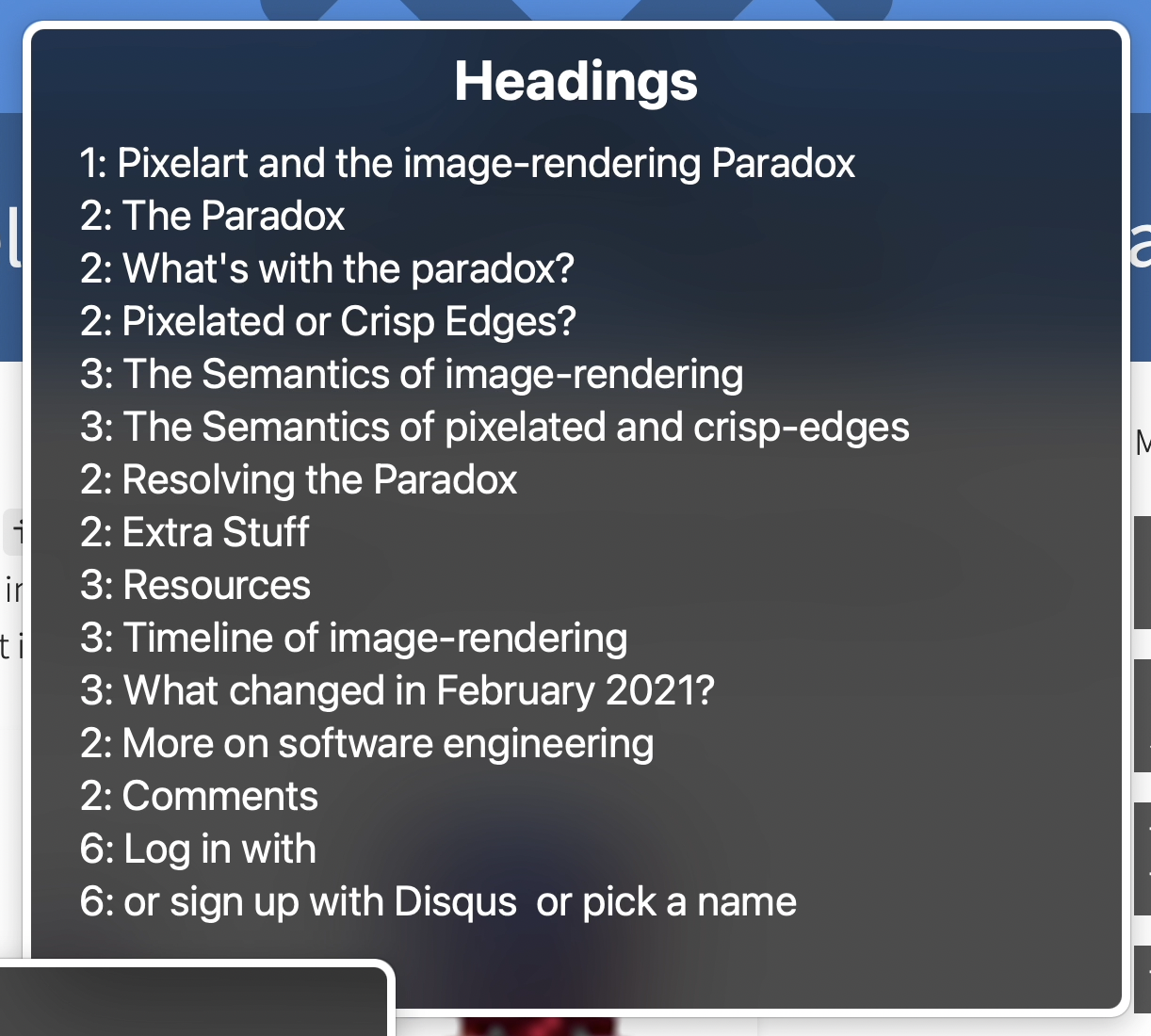
A screen reader is capable of reading the content of a site out loud to those who either can't or would rather not read the text. As a feature, they allow people to look at all the headings on a page to jump to where they want to go.

Well, each of the pages on my site use to have two level one headings: one was the page title, but the other was the website's title, "Auroratide". And that website title was the same on every single page. That would be pretty annoying to someone using a screen reader!
The change? Instead of using an <h1>, the site's title no longer uses a heading at all and is simply styled to look like one.
<a class="page-title" href="/">Auroratide</a>
Tip 29: alt attributes
Permalink to "Tip 29: alt attributes"Images are fantastic, but not everyone can see them. Therefore, it is important each image has a suitable text replacement which can either be shown to someone or read aloud by a screen reader. This is called an image's alt attribute.
Before finding this article, I had already audited every single image on my website to give them suitable text alternatives, but this point is so important I decided to bring it up anyway.
To write good alt text, imagine you are sharing an article with someone over the phone and need to describe the image to them with words. What you say is generally good alt text! For more on that, here's an article I had recently written:
Tip 43: Include a skip link to bypass site navigation
Permalink to "Tip 43: Include a skip link to bypass site navigation"Some people prefer to navigate a website entirely with a keyboard, pressing Tab to go from landmark to landmark.
Usually, pressing Tab on a page for the first time takes you to the very first link, which might be the site's title.
After the site's title are the navigation links.
And after that is the actual page's content.
Now imagine hopping from page to page on a site, and every single time a new page is loaded you have to Tab through the entire navigation just to get to the content. Hence the skip link!
A skip link allows someone to bypass the navigation and get directly to the content. As such, it is generally the first focusable item.
A basic implementation links to a main element in the document, hiding the link off-screen until it becomes focused:
<a class="skip-link" href="#main">Skip to Content</a>
<main id="main"></main>
<style>
	.skip-link {
		position: absolute;
		left: -9999px;
	}

	.skip-link:focus {
		top: 0;
		left: 0;
	}
</style>
Tip 52: Font Size
Permalink to "Tip 52: Font Size"I remember the early 2000s where websites had itty bitty Times New Roman fonts. At the time I was also itty bitty and could read those fonts; nowadays, any time I encounter one of these relics of the past (almost always some .edu site), I struggle severely!
Today, the standard minimum font size is 16px.
For reference, this sentence is sized to 16px.
Before reading the accessibility tips, my website had a base font size of 18px, which is actually bigger than the minimum. However, I often make use of side text, stuff tangential to the main content but I feel is worth including. This side text uses a smaller font, which dipped it into a range smaller than 16px. Yikes!
As a result, I universally bumped all font sizes up so that now the smallest font possible is 16px, and the usual font is 20px. In fact, the universal increase was necessary since I like the aesthetic of a thin font, but using a thin font raises the size threshold in order to remain accessible.
Tip 85: Don't forget the :visited state
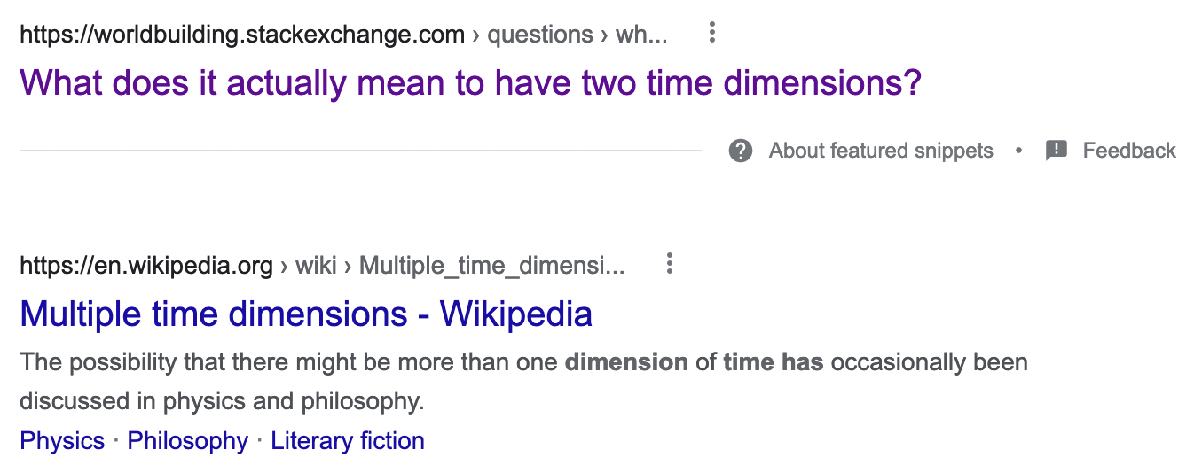
Permalink to "Tip 85: Don't forget the :visited state"You've probably seen this before if you've used the Google search engine: links you have been to are a different color from those that are new.

Turns out I rely on this feature (more than I care to admit) to re-find pages I should have bookmarked! From an accessibility standpoint, differentiating visited links is especially important for those with memory impairment. And thankfully, all it takes is a couple lines of CSS!
a:visited {
	color: var(--skin-text-visited);
}
Prior, I had deliberately made all my links the same out of aesthetic preference. However, learning how this simple change could benefit a lot of people convinced me to apply the difference, and honestly I quite like it now.
Bonus Tip 101: People are not users
Permalink to "Bonus Tip 101: People are not users"And finally, my favorite tip: Do not call people "users"!
At least for me, I get very different mental images when I think of users versus people. It's the difference between thinking of the website, or thinking of the face behind the website. I develop far more empathy for the latter, and ultimately empathy is at the core of accessibility.
The Other 95 Tips
Permalink to "The Other 95 Tips"This was just a list of five improvements I was able to make to my website from a list of 101 tips. Even if it's a bit much to read at once, I highly encourage you to at least bookmark GrahamTheDev's article to reference when needed!